
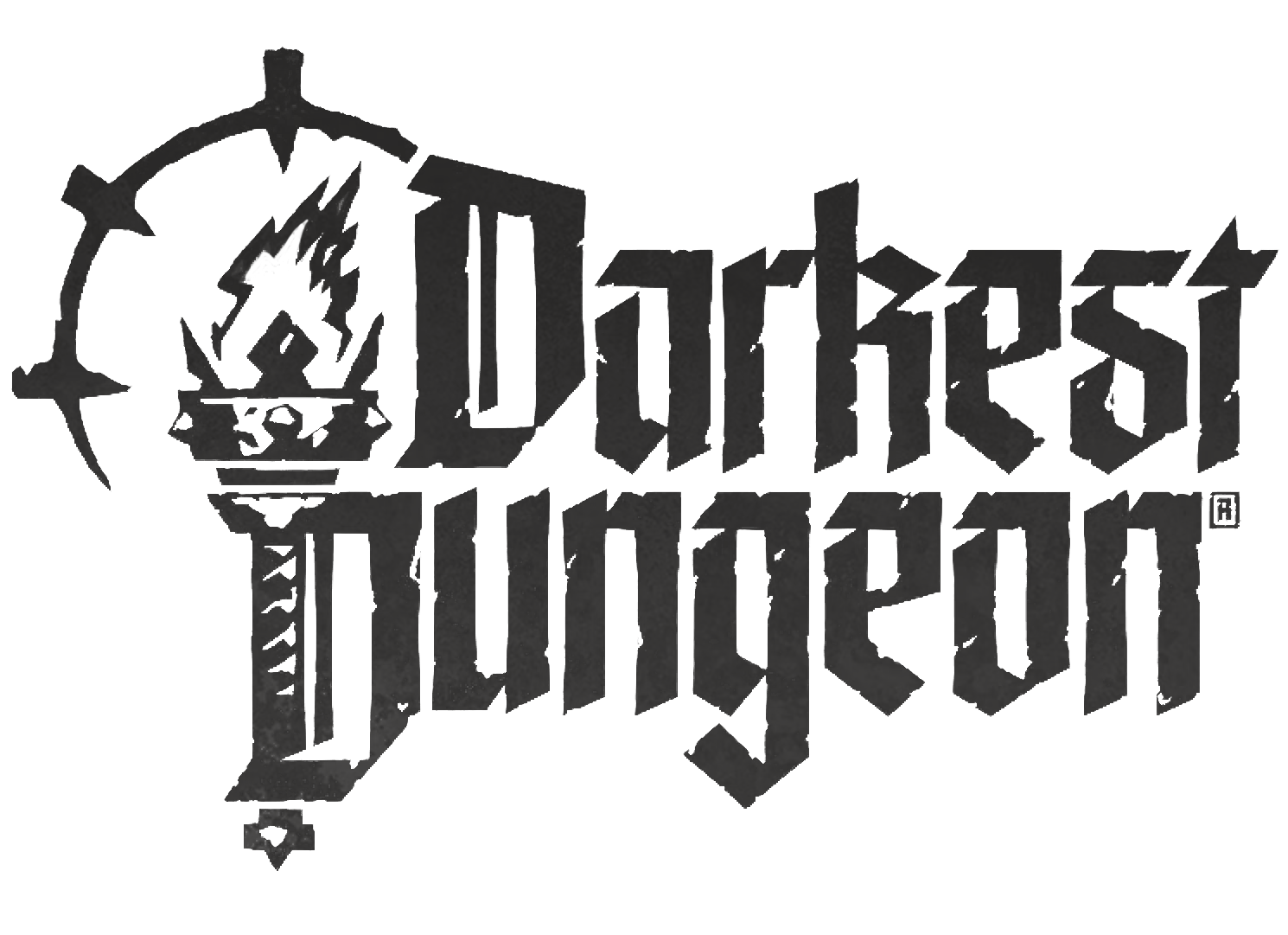
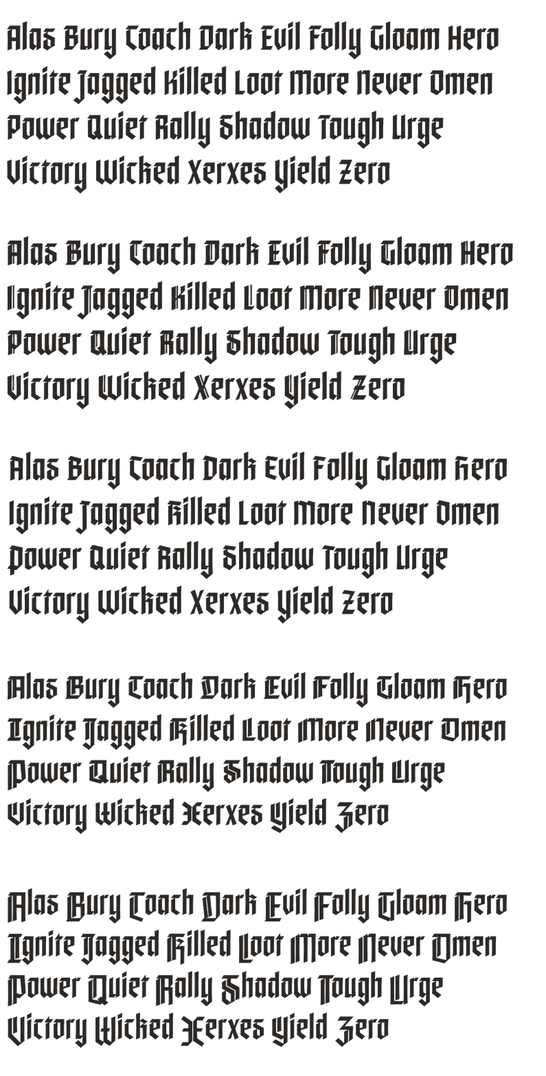
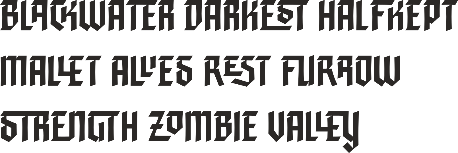
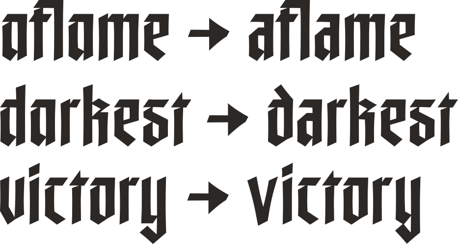


The phrase "Glory and honor to that ragged band, whose triumph healed the world." in the typeface Rampart. Rampart is a stark blackletter font, with no curves, and slight triangular cutouts where horizontal strokes meet vertical ones.The Darkest Dungeon logo. It features a torch, whose handle becomes the left side of the D in Dungeon. The text is set in Rampart, and stylized to look worn and battered.A gif showing the same 26 words, one starting with each letter of the alphabet, as they cycle through stylistic sets of Rampart. The sets are: Standard, Thin Line, Angled Top, Double Line, and Drop Caps.Various words set in Rampart in all caps that show off examples of ligatures, like C/K, E/S/T, and L/L/E, for example.Three examples of words without and then with legibility alternates turned on, set in the typeface Rampart. The lowercase "a" moves from single story to double story, the lowercase "d" gets an angled ascender, and the lowercase "v" shifts from vertical sides to angled ones.The words "Кириллический алфавит" in the typeface Rampart.A demonstrative sample of symbols designed as part of the Rampart typeface. They share the same stark shape language and triangular cutouts as the letters in the typeface.
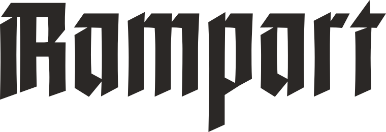
The word "Rampart" written in the typeface Rampart.

designed 2025

In the spring of 2025, I was hired by Red Hook Studios to design a custom typeface for them. We worked together over many months to arrive here—a blackletter with bite. This was honestly a dream project; they were a great team to work with, I had a ton of fun, and it’s been super cool to see how they’ve been using it!

The phrase "Glory and honor to that ragged band, whose triumph healed the world." in the typeface Rampart. Rampart is a stark blackletter font, with no curves, and slight triangular cutouts where horizontal strokes meet vertical ones.The Darkest Dungeon logo. It features a torch, whose handle becomes the left side of the D in Dungeon. The text is set in Rampart, and stylized to look worn and battered.A gif showing the same 26 words, one starting with each letter of the alphabet, as they cycle through stylistic sets of Rampart. The sets are: Standard, Thin Line, Angled Top, Double Line, and Drop Caps.Various words set in Rampart in all caps that show off examples of ligatures, like C/K, E/S/T, and L/L/E, for example.Three examples of words without and then with legibility alternates turned on, set in the typeface Rampart. The lowercase "a" moves from single story to double story, the lowercase "d" gets an angled ascender, and the lowercase "v" shifts from vertical sides to angled ones.The words "Кириллический алфавит" in the typeface Rampart.
The words "Alternate Capitals" written in the typeface Rampart.

Four sets of alternate capital letters, ranging from subtly different from the default to completely different drop caps.
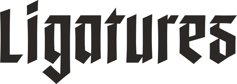
The word "Ligatures" written in the typeface Rampart.

Dozens of discretionary ligatures!

The words "Legibility Alternates" written in the typeface Rampart.

Alternate forms for various letters were included for greater legibility at smaller sizes, when necessary.
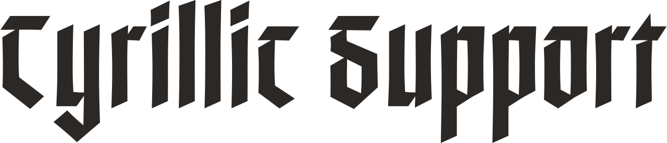
The words "Cyrillic Support" written in the typeface Rampart.

Thanks to Red Hook Studios’ translation folks for their assistance in designing a matching Cyrillic alphabet!
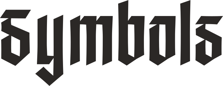
The word "Symbols" written in the typeface Rampart.

Dozens of symbols (not all of them shown here) rounded out the typeface.

Artwork © 2026 Red Hook Studios, Inc. All rights reserved.

© Prologue Type, 2026
